Approaching UI/UX design for a success using Design Principles
Imagine a scenario that a client is asking to add a feature or more functionality to a screen that already has so much on it. You feel sad and confused as you have no room for this, where you gonna put it, so your next call of action is to call the UX team.
So the question is what does the UX team does which solves many our problems as a developer
The goal here is very simple and that is to go over with creating a simple UX and also to make you understand the process so that your future conversations become simple and easy.
To do that I’ll be going with three stages of Design Principales, to transform one very clutter design into something which is more readable and usable to the users.
I have divided these Design Principles into three major categories
Design Principles
- Words
- Decluttering
- Clarity
To get started let's look at the below screen and try to understand what's going on there

This screen contains all of the things the users want to know and I have added them into one single screen making it as its home page.
And as you might have noticed it's very very busy hard to scan and there is a lot of content to read.
So in the process what I am going to do is talk about the things which are important to UI/UX design and in the process, I will apply those methods to this screen and see how those methods help to fix this screen.
After looking at the screen we can see that the lack of organization especially with the text which leaves us to my first point.
Word
If there is one thing I have learned by doing countless tests for countless different workflows ranging in different levels of complexities it's very simple that People Don’t Read.
People Don’t Read
It's because of this fact that when and where we putting words we need to make sure that they are meaning full and as clear as possible. You may say several different things, that they are lazy, they are careless, they are in a hurry or they just hate to read, whatever angle you are taking the result remains the same that people don’t read or users do not read most of a UI no matter how great the words are.
So we have to be sure to trim it down, add headings, use lists and prioritize those words by means of either using colors or text sizes and etc.
Speak human
So the first step on top of that is Speak Human, just to be clear our users are not robots the design needs to speak to them like people, in a nutshell, it should be like talking face to face with a human.
Just think about if one wrong word can ruin someone's experience as a user why waste time trying to decode what someone is saying on a screen especially when their time is precious and every second they spent that time they just wanted to make a decision as quick as possible. And always remember to write with your heart and edit with your brain.
The way I see it that the very first draft of the design comes from the heart and then we edit afterward, you trust your guts, once you have written out your ideas, you can turn to the research and refine those as needed. Just go with the rule, if it doesn’t sound right to you, it does not satisfy the way you have written it, it's very likely the users will feel the same way, so trust your instinct.
Use Trends
If you ever get in a situation where you are not sure if you are using the term correctly, go check the trends on Google
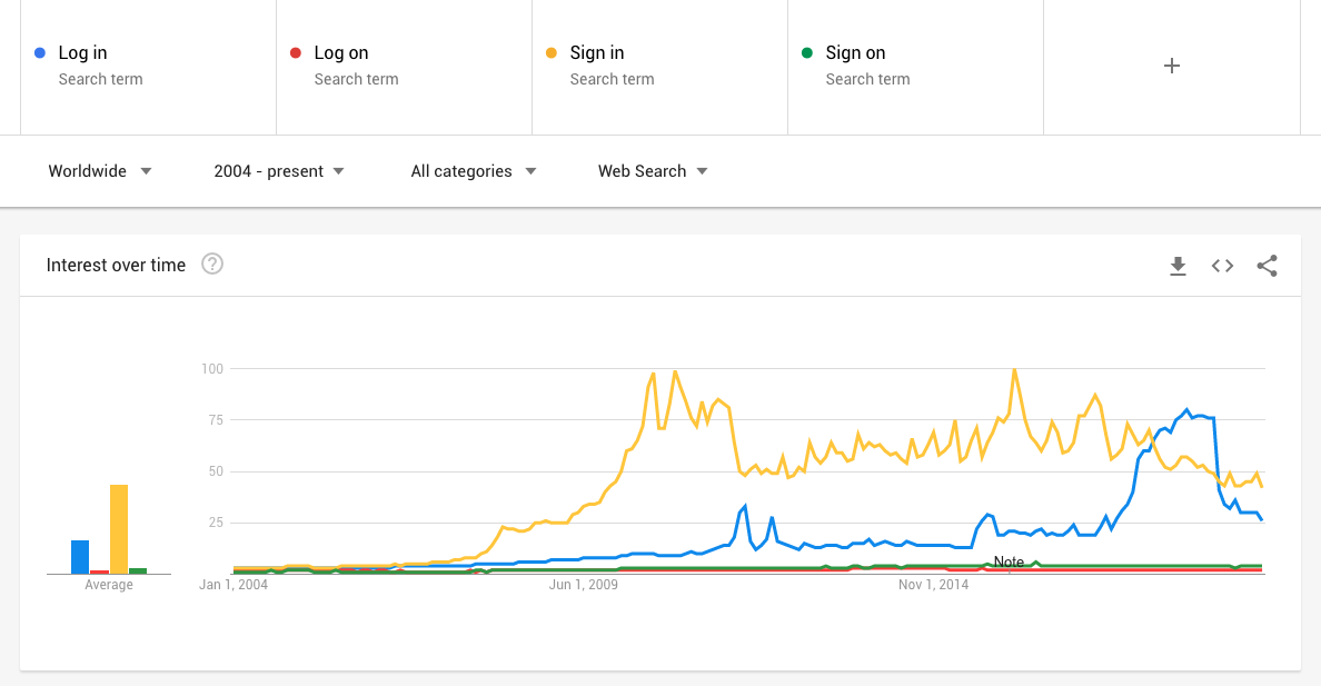
For the above example, if we compare the text “log-in”, “log-on”, “sign-in” and “sign on” to decide what is being been used globally, by using a resource like this we can find out that in this specific example that “sign-in is widely used more than the rest.
So we can take those words down we have written instinctively and found out that this the word that is used is a lot of applications more than the other ones. By doing this we make an immediate connection with our users by using the terms they are more familiar and they are able to recognize.
Consistency is key
Lastly, we need to make sure to always be consistent, consistency is key. So just like we have a style guide and want to be consistent with our design and our functionality, we need to make sure that words are consistent.
Users will get very confused if we use the same terminology for different purposes or the same terminology for different purposes, this includes all range of texts, buttons, labels and everything in between.
This is not just about confusing the user but again if we are using the same terminology across our solution we are conditioning them to our voice, our tone, and our language and this will also help to build the personality.
So let’s apply the things we have discussed in the words section to our old design and see how it turned out.
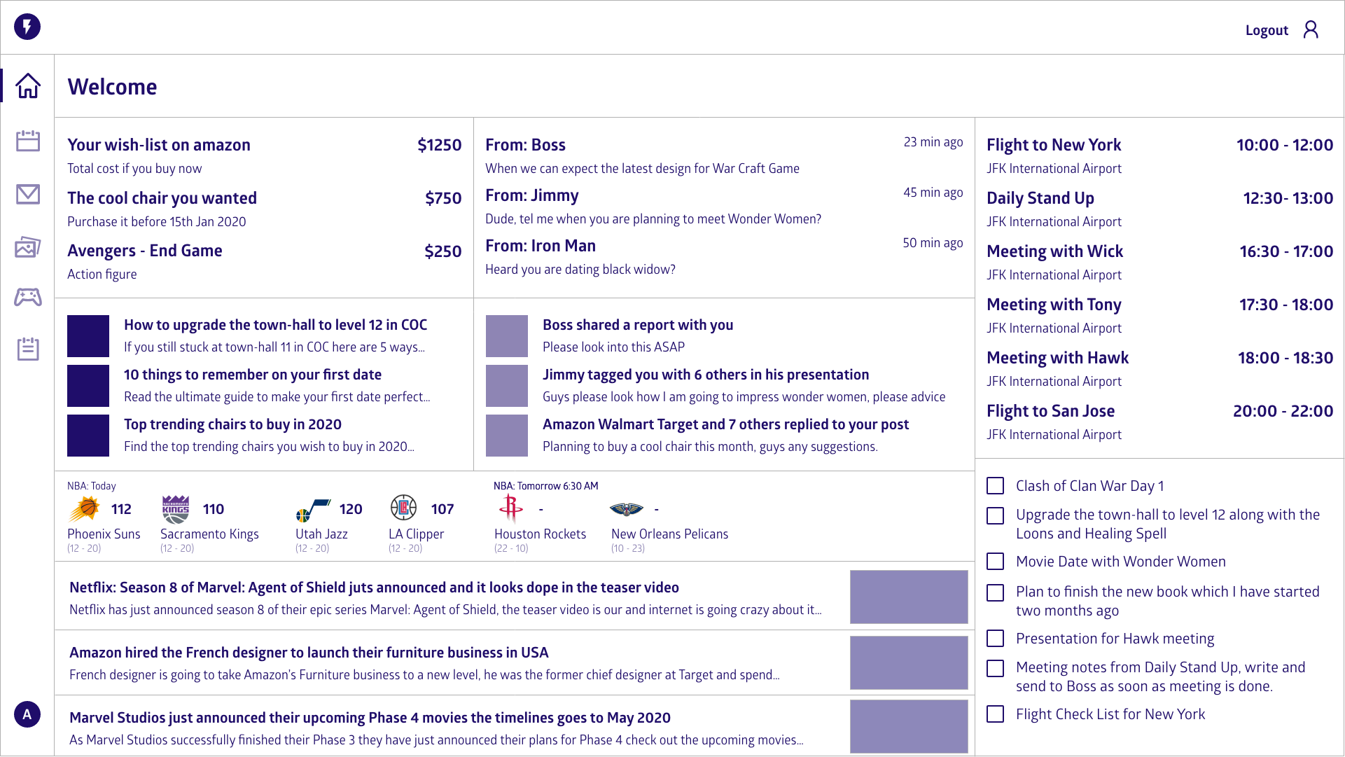
As you can see I have only applied the text related changes by adding weight to the heading, increasing the font sizes a little to make things stand out.
This does not have that much significance changes into the overall design but you can see things are started looking better compared to the one we had in the beginning.
Decluttering
Remember those meetings with the Product team in which we discussed what we need to have on the page and answer always was all of it. No matter what questions you bring their answers remain the same, yes we want all of it on the page.
Only add what's important
It may sound like a good idea to put everything on the screen that the user needs at once but we need to understand that the user’s attention is a precious resource and it should be allocated accordingly.
So cluttering our interfaces overload the users with way too much information, every added button, image and every line of text makes the interface more complicated. And again it may sound appealing but it could have seriously a negative effect on usability, how faster the user actually can use our solutions and the cognitive load.
The cognitive load
The cognitive load simply means the amount of working memory resources is needed to understand something by anyone.
The below quote always fascinated which I love and its always on my back of the head which says
Perfection is achieved when there is nothing left to take away.
— Antoine de Saint-Exupery
It doesn't finish off by saying “when there is nothing left to add” so let’s remember that. Information put on a screen for any reason other than being absolutely essential adds to the cognitive load.
By adding to the cognitive load we lose both, the valuable space and the patient of our users. So as they don’t read we have to make sure that the only thing they have to read is they need to, to complete the task. So we need to reduce the effort they have to put in to get what they want.
Clear screens are good
This is very important to remember even it sounds like little against the norm and that is 100 clear screens are always better than 1 cluttered screen.
I can understand that we have a lot of data but being selective about what data we show could have major benefits. When we focus on decluttering then we think about ways to collapse information or reduce the call to action by only showing the required content and initially hiding the content so if the user needs that, they can call for it.
This may sound intimidating and unappealing, however, by doing this correctly we are allowing the user to dig deeper when they need to, in the sections where it necessary and it causes less confusion and a happier user.
Whitespace
Whitespace is good if used correctly it can help immensely with the legibility, usability and overall experience to our users.
So into the same screen, if we apply the techniques of decluttering and whitespace. the screen suddenly becomes clearer.
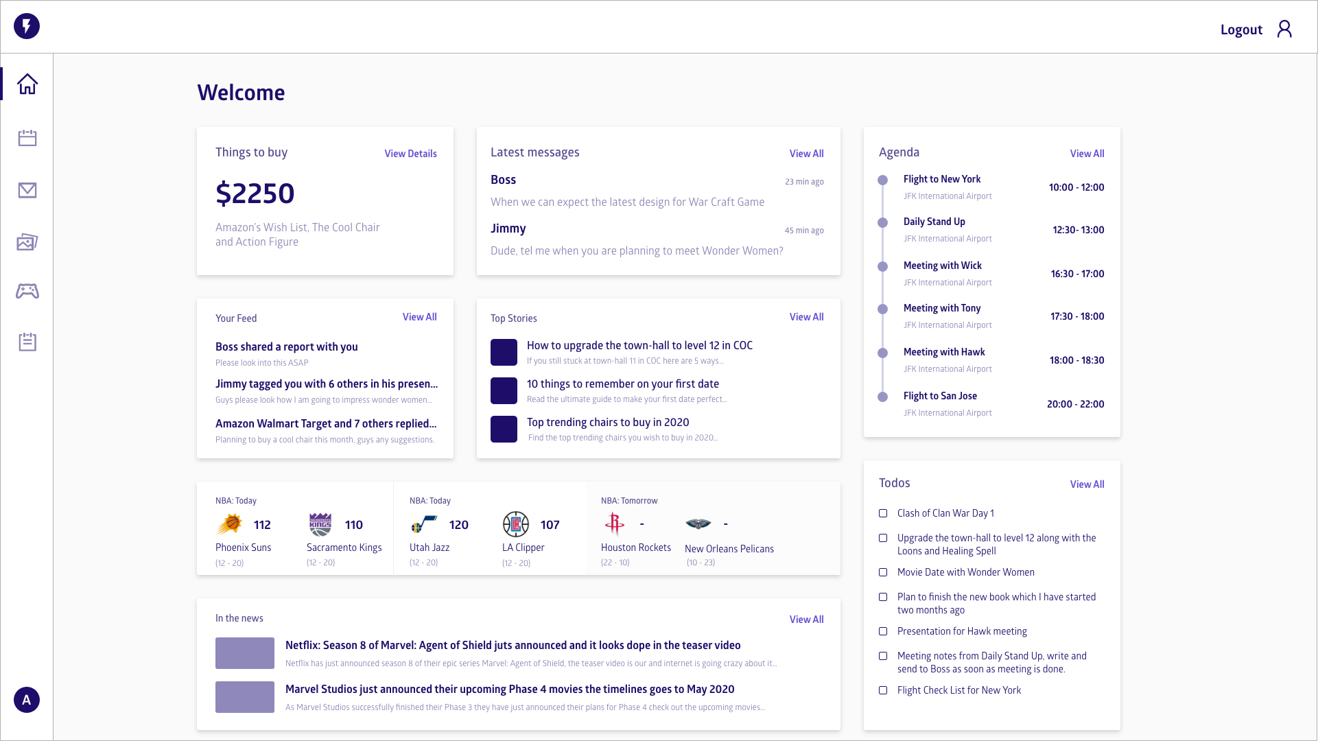
So this is a large update in the screen and how the information has been displayed, we have introduced a grid system, we have added space and make sure it's consistent around the screen and also we have added lots of white space.
The information like agenda, todos, feed, and top stories are reduced and added links to dig deeper if the user wants to.
This allows the user to have a quick look and easily understand what is important for now and if he wishes to dig deeper he can click on the links given on each section.
So now as we have cleaned up the design it's really not the best place it can be, there is really some confusion, we cleaned it up but is it any more useful. We can read things quicker but is it really helping the user.
So let’s move on to the last item in the design category called Clarity.
Clarity
Now you may be thinking isn’t clarity and decluttering is kind of the same thing. No, it's not.
Decluttering is removing all those information, we don't need at the time and clarity is using what we have got leftover in such a way, that the user has no confusion that how to complete a task or if I click on that link what gonna happen.
So if we do it correctly, improving clarity should feel like an invisible hand which guides the user along the journey, after all even the coolest feature and the most compelling content is useless if no one can find it.
This next quote is trimmed to get an idea of what clarity is
Clarity refers to the focus on one particular message or goal at a time, rather attempting to accomplish too much at once.
— Michael Hoffman
What I want you to take from that is when we talked about the words and the words that just don't matter, we also have to remember this has to apply on actions as well. So we need to make sure that we do not say that wow I have cleaned up the screen but there are potentially dozens of things you can do on it.
If there is a lot of stuff on the screen, it is still very confusing. We need to make sure that we keep everything clean and clear.
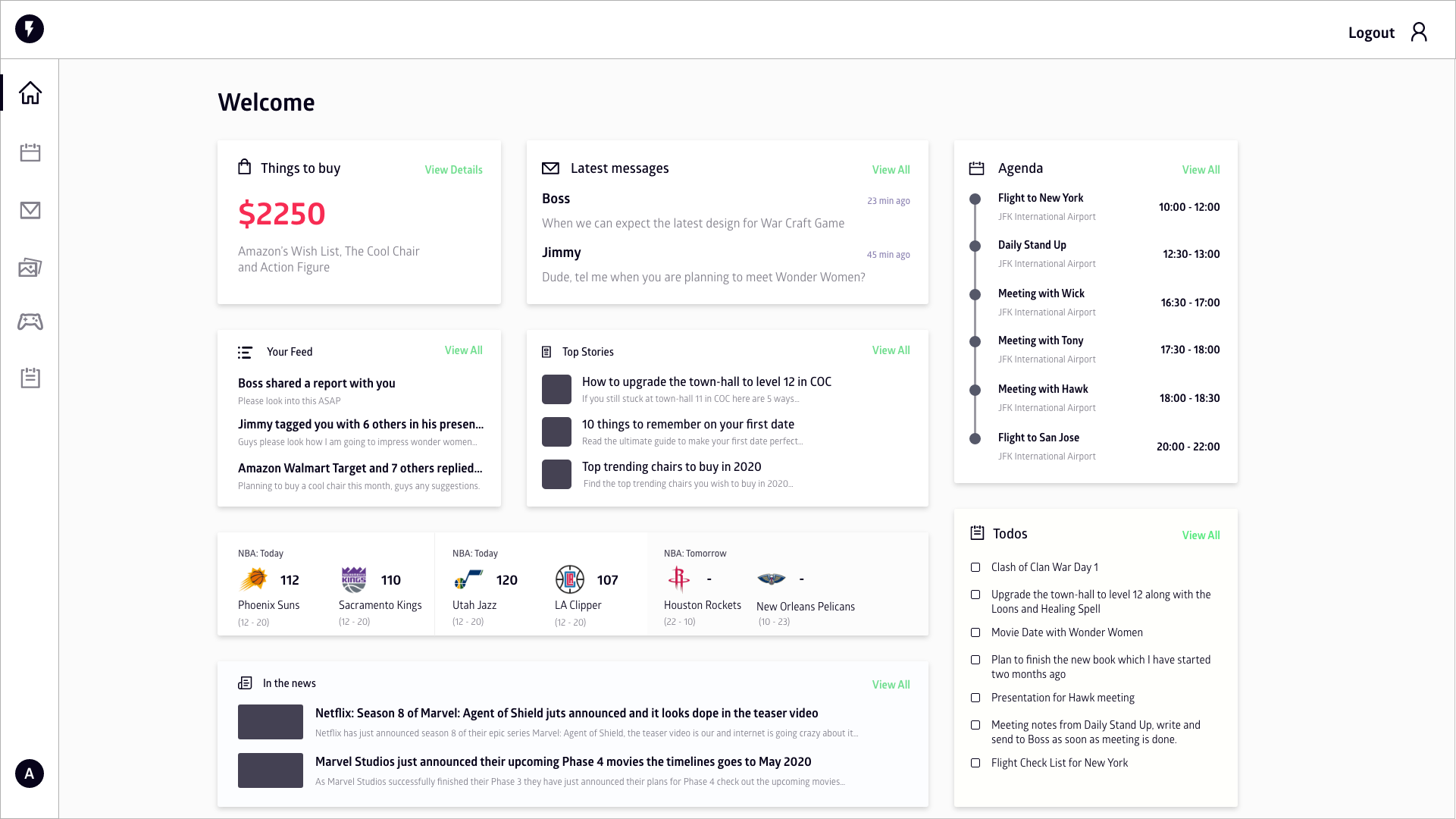
So on the same screen, I have added some colors to make things stand out, changed the default color to something which is more familiar to the user. Added icons to the content sections to make it more clear even without reading the label to that section.
Conclusion
So now you can see how these design principles help fix the screen and make it more readable and usable by reducing the cognitive load from the user so that they can concentrate on what’s important.
The key takeaways from this article are to understand that the user’s attention is a precious resource and we should be very careful to use it where it is necessary.
Happy Designing.

Ashok Vishwakarma
Google Develover Expert — WebTechnologies and Angular | Principal Architect at Naukri.com | Entrepreneur | TechEnthusiast | Speaker